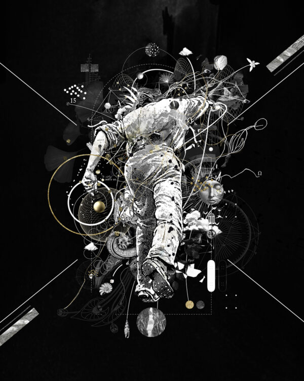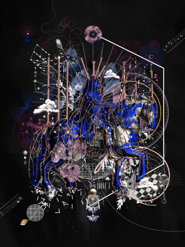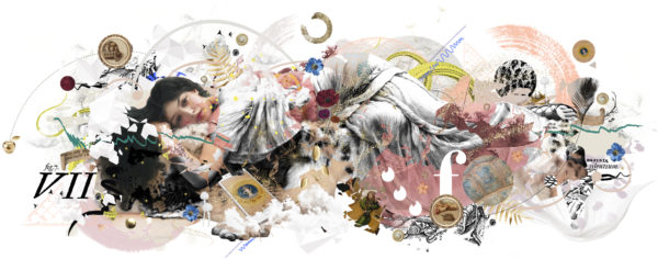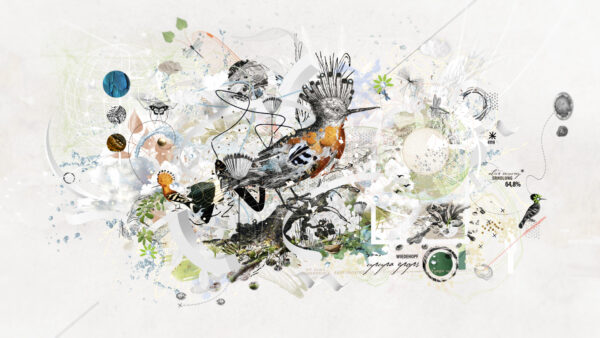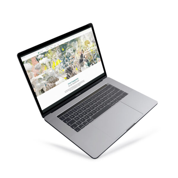

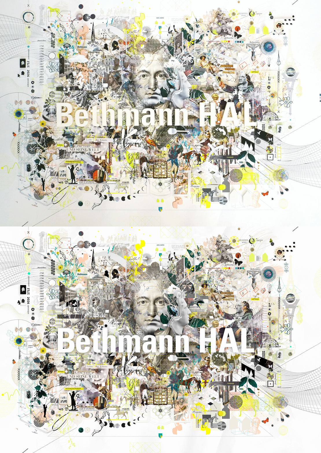

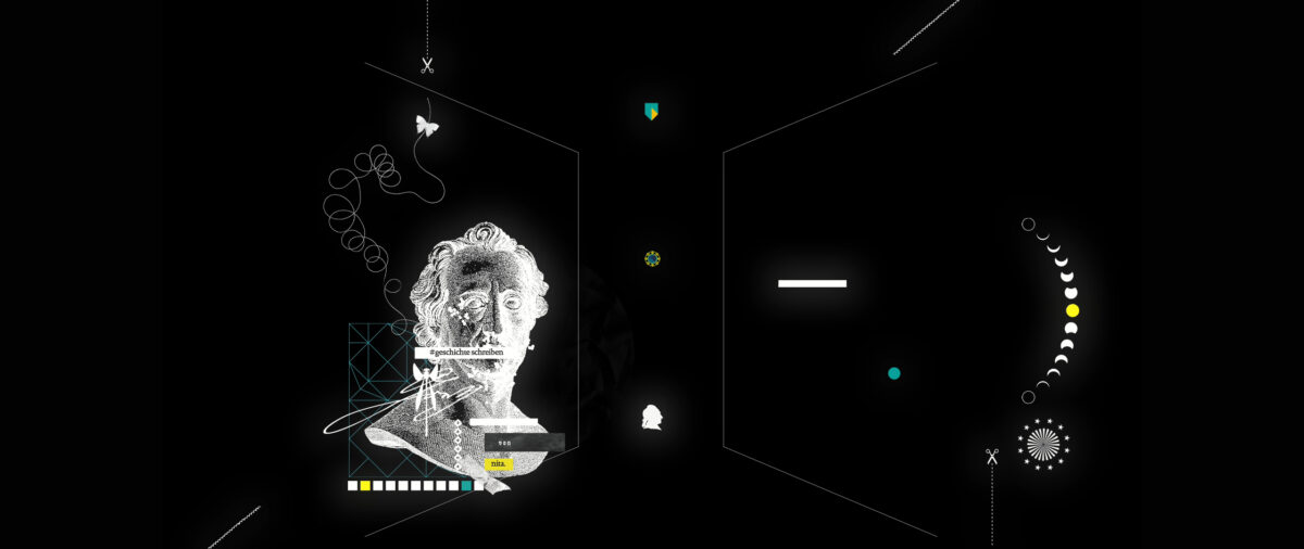
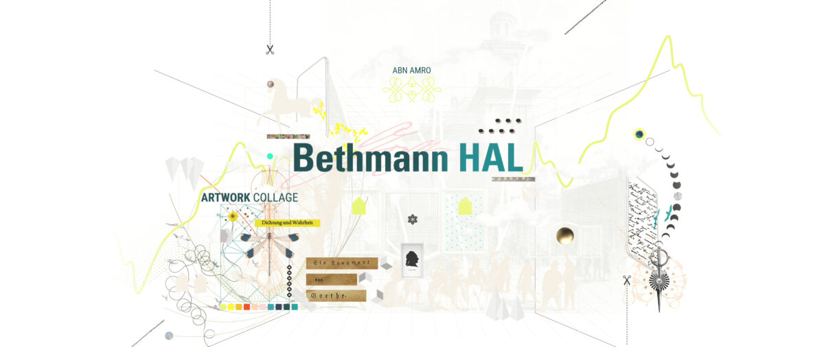
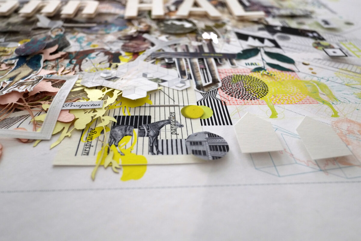
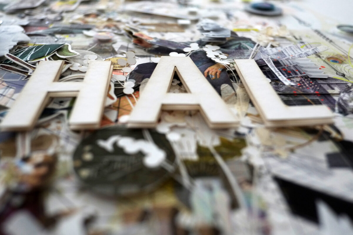
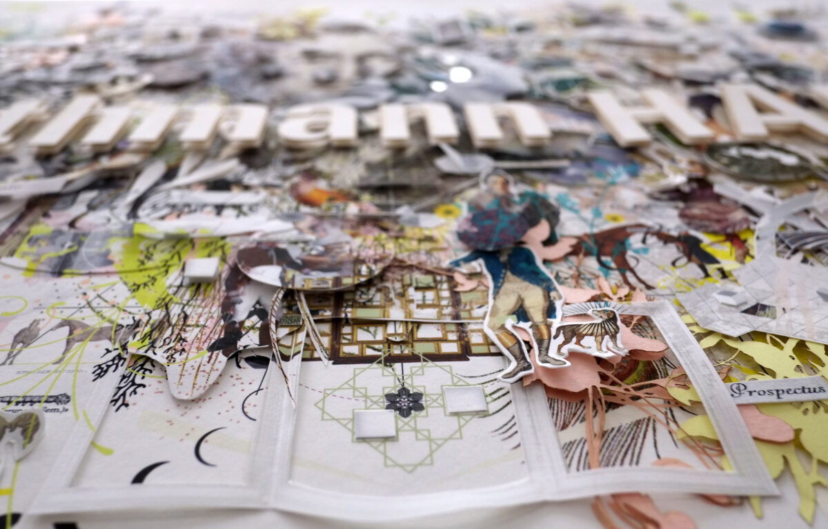
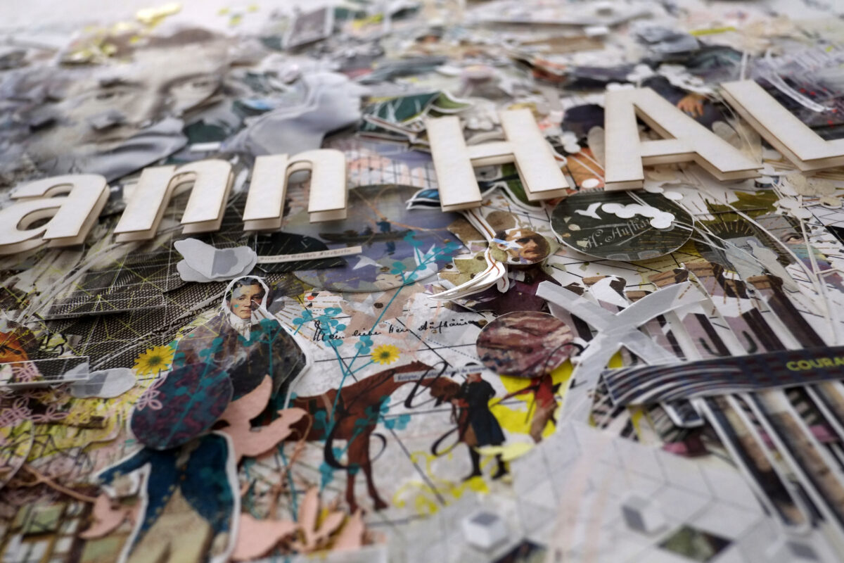
*2026 & as summer arose in its full range of colours i found the muse & muße to showcase ‘goethe in fragmenten.’ here it is one fabulous commission. humble minded i need to admit that throughout the process i transformed to the sorcerer’s apprentice myself. i am very grateful for the trust & a beautiful task from bethmann HAL. i was asked to realise an artwork for the occasion of the fusion of two well established private bank houses – each one harbouring a widespread & long tradition – furthermore a clear strategy & focus in now & future, a sustainable vision defined by their core values. the mission was challenging as well as insightful – underlining the existing typographic word mark with a sujet. the basic concept was transferring the digital artwork in an analogue large format collage which is displayed at the bank premises in frankfurt, as major purpose officiates as an on & offline communication tool for the fusions disclosure.
‘ach ich merk es! wehe! wehe!
hab ich doch das wort vergessen!
ach, das wort, worauf am ende
er das wird, was er gewesen!’
johann wolfgang goethe
(sorcerer’s apprentice 1797)
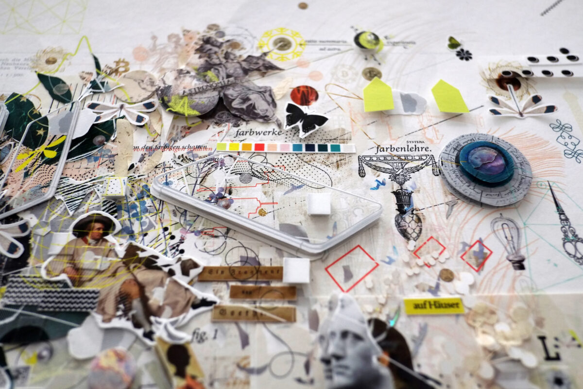
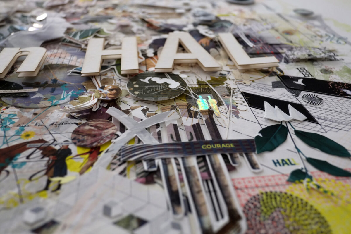
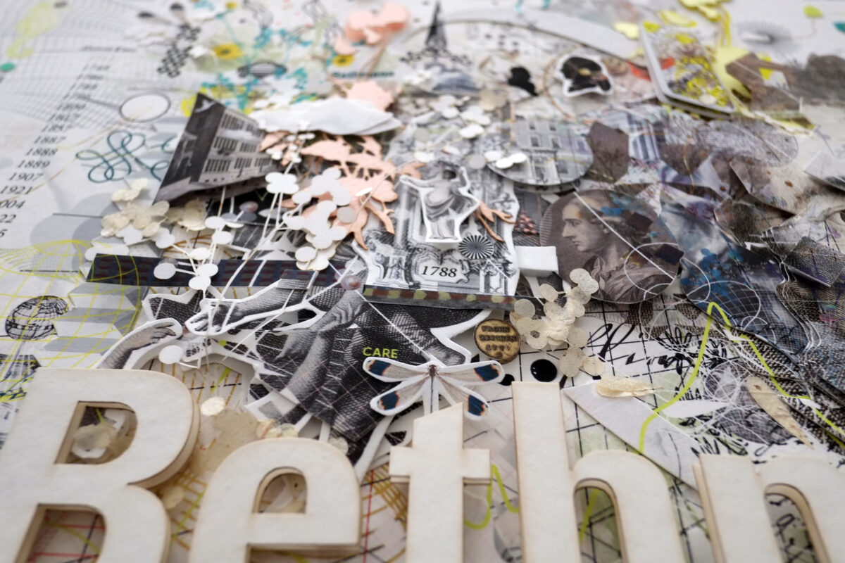
my alchemy started with entering the forrest researching fragments. during the enquiry i was confronted with many figures & historic milestones. my research was a venturesome discovery. in the woods of findings i met goethe as the least common denominator or multiple, a bridge & linking element. during his lifetime he created paper silhouettes himself – mostly self portraits. i also admire his insights on colour. this was the kind of synergy & disposition which made me decide to define him as the central character. the key figures & founding persons of bethmann & hal, architectural details, flora & fauna add-ons, dates & founding milestones are some of the side notes which enliven & frame the image. i love the kind of projects which are insightful, complex, surprising. learning is lovely, reading is traveling somewhere else. back from the short excursus – how to distinguish & underline a word mark. i kept the existing corporate design language. within the collages composition i worked with the cd shape, colour typography & enhanced it for some vivid highlights. it was the conscious idea of leaving the screen for a date with beautiful paper – hands on scissors & glue, partly it felt like an enigmatic puzzle, sorting things in matchboxes as some of the cut outs where pretty tiny. laser cutting rice paper – a vain undertaking, working with fragile paper materials. i wanted to reach out for something which one might actually feel, touch, something where beholders could sense the human kind behind. an artwork which might pick you up from any point of view – something which asks for your time in many layers. beyond commercial, timeless, not polished, no gloss. a branded key sujet allowing imperfections. as a visual storyteller i am happily – not ever – but after the analogue artwork found it’s safe way to it’s new home in frankfurt beginning of june. a merci to bethmann hal for the trust – the briefing, feedback & communication culture. thanks to felix schrader senior manager of communication & practice. #geschichteschreiben. ♥︎
if you aim to have a brief glimpse of the process – watch the slightly dada & ruff making off & documentation below.
client | bethmann hal ABN AMRO bank N.V. frankfurt branch
corporate design | provided & (c) by bethmann hal
technique | mixed media digital analogue reverse collage | paper cutout & laser cut elements
typography | ABN Amro Sans, minion pro, documenta, 18th century current & original archival type
print & paper | pigment ink on hahnemühle fine art papier (bamboo 290, rice paper 100, matt fibre 200)
further materials | fabriano tiziano paper, iridescent cardboard, vat paper
audio sfx making of & teaser | schubert – impromptu no.1 – op 142. | sfx own & rf